Other than this minor update of its logo back in August of 2014, the new brand of Alaska Airlines is the first major change in 25 years; and the brand refresh unveiled recently to a crowd of approximately 1,800 employees shows a streamlining of the logo and the livery of its fleet of aircraft.
Here is a video with an explanation of the new brand for Alaska Airlines by Sangita Woerner, who is the vice president of marketing for the airline:
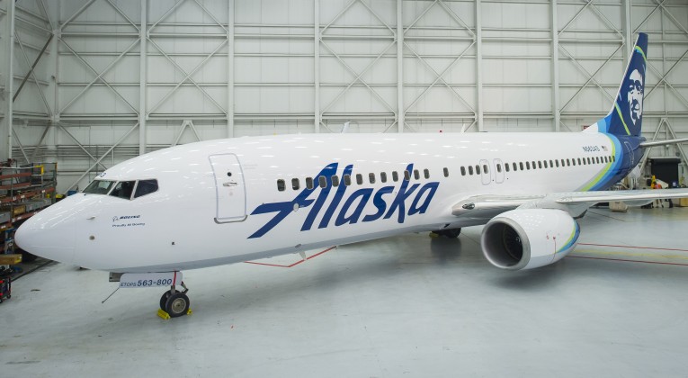
The Eskimo Lives On — But Who Is It?!?
The Eskimo face on the tails of the fleet of the aircraft — which first appeared in 1972 — will live on and not disappear. There was an apparent attempted to retire the Eskimo face back in 1988 in conjunction with a new logo for Alaska Airlines, according to this article in the Los Angeles Times — but it proved to be unpopular with many Alaskans.
“It may not be the best representation of an Eskimo, but it’s our Eskimo,” said Tim Kelly, the late state senator for Anchorage. “(Alaskans) feel an affinity with the airline. Alaskans feel it’s their airline.”

The same probably holds true today, as that Eskimo face has a rich history. It was thought to be the portrait of Chester Asakak Seveck — a reindeer herder and an Eskimo dancer who greeted deplaning tourists at Kotzebue for years as a tour guide for Wien Air Alaska, the first airline in Alaska and one of the first airlines in the United States — who died on Sunday, January 18, 1981 at the age of 91…
…but according to the official Internet web site of Alaska Airlines, that face painted on the tails of the fleet of aircraft is also thought to be the portrait of Oliver Amouak, who was “an Inupiat Eskimo who was hired by Alaska in the late 1950s to perform in a traveling stage show called ‘It’s Alaska!’” and died in 1987.
We may never know the identity of the person on whom that Eskimo face is based — but we do know that he now has highlights of color around him in the new logo, as “his profile has been modernized and new vibrant colors added around his parka trim, which include Tropical Green and Breeze Blue, reminiscent of the tropical regions Alaska serves including Hawaii and Costa Rica.”
The Eskimo face is overall more stylized and less realistic in the latest branding scheme. Some of the differences are seen in the hair and in the shadow over his mouth, as two examples; and his smile seems to have been slightly altered.
The Logotype Changes — Again

Smoothed in August of 2014 in a slight refresh from the logotype which gave that rustic impression of the Alaskan wilderness, the logotype underwent another transition with the brand refresh where it has all but lost its serifs, further streamlining its look.
As for the latest logotype, the intent was to give it a cleaner and more sleek appearance; and it succeeds in doing just that — but that success may actually be perceived as a failure, as it is arguably the most boring of the three logotypes. The rustic look of the rugged logotype from before August of 2014 seems to emulate Alaska better than any of the other logotypes displayed above…
…and what is with that clunky typeface known as Circular which spells Airlines underneath the newest logotype? Similar to the intermediate logo, the font size should be smaller; while the tracking of the letters should be increased.
Perhaps what should have been done is to keep the Alaska part of the logotype in a rugged form whose mere appearance immediately suggests Alaska, as if it were not for the retention of the Eskimo face, the storied heritage might be completely lost in the new branding of Alaska Airlines; and the word Airlines should have been italicized in a less conspicuous yet more modern sans serif typeface with either a light, book or medium weight — perhaps Avenir or Futura as a couple of numerous examples which are superior choices to the current font.
Summary
Alaska Airlines has been growing beyond its largely regional presence for quite some time; so the need to refresh the brand to incorporate its growth and the increasing number of destinations it serves into its brand is understandable.
The addition of accent colors to refresh the branding is not a bad idea; but Tropical Green and Breeze Blue just do not seem to work. It is like Hawaiian Airlines incorporating the colors of winter destinations into its branding. Perhaps colors which emulate Alaska — or even the Arctic, such as a deep yet brilliant Iceberg Blue, for example — should have been considered instead.
While the branding scheme is not terrible by any means, it could have been better, as it is just too clean — and somewhat sterile — for an airline which is supposed to evoke the ruggedness of Alaska.
Source: Alaska Airlines.