Saul Bass would have been 98 years old today — he passed away slightly greater than 22 years ago — but one of his most famous works is no longer in use.
If United Airlines is your preferred airline of choice, you might have lamented the decision to retire what is popularly known as the “tulip” logo in favor of the abstract globe logo used for years by Continental Airlines when it was merged with United Airlines.
Remembering the United Airlines “Tulip” Logo and Its Designer
The “tulip” logo — a red, white and blue abstract of the letter U — survived three branding changes for 38 years since it was first introduced in 1974, replacing the “vertical spike” logo which preceded it. The “tulip” — originally designed by Bass — was updated in 2004 by Pentagram in a monochromatic blue scheme as part of a refreshing of the livery of United Airlines.
Ironically, Bass also designed what was known as the “jetstream” logo of Continental Airlines back in 1968, which in the early 1990s was also replaced by the abstract globe logo developed by Lippincott.
With its inherent inaccuracies, I never particularly cared for the abstract globe logo of Continental Airlines — even when it was first introduced in the early 1990s along with the the logotype using a modified bold version of the Perpetua typeface, which would not have been my first choice of typeface to use for an airline.
Along with the globe logo, I found the Perpetua typeface to be staid, stale and stagnant — not exactly the image one wants to convey to represent an airline, in my opinion.
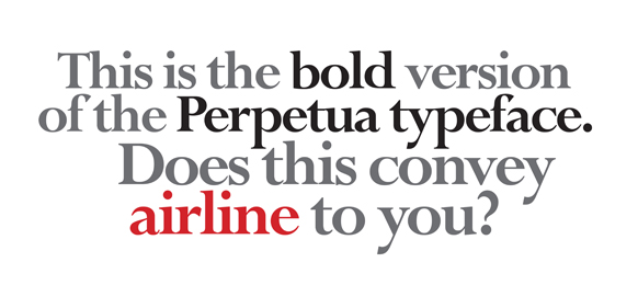

I am just thankful that United Airlines decided not to use the Perpetua typeface for its current logotype, as was used temporarily during the merger with Continental Airlines. I am not thrilled about the sans-serif typeface used in its current logotype either — but it is a cleaner choice than Perpetua. Then again, it does not differentiate much from the custom logotype of Delta Air Lines, which also uses a blue sans-serif typeface letter-spaced against a white background which was first introduced on Monday, April 29, 2007 when Delta Air Lines emerged from bankruptcy protection.
The Delta Air Lines “Widget” is Literally a Gas?
Interestingly, the “onward and upward” brand identity for Delta Air Lines was also created by Lippincott. Some have compared the duo-toned red “widget” with the Citgo logo device.
![]() The logo of an airline — usually placed on the tail of aircraft in its fleet — is seen around the world and in the air; in advertising of all forms of media; throughout the social media universe; and on collateral material ranging from in-flight safety cards to cutlery to napkins. That logo should evoke motion and flight — along with the excitement and wonderment inherent in travel. Saul Bass — a medalist in 1981 as honored by an organization known as the American Institute for Graphic Arts, of which I was once a member — apparently had a knack for doing that.
The logo of an airline — usually placed on the tail of aircraft in its fleet — is seen around the world and in the air; in advertising of all forms of media; throughout the social media universe; and on collateral material ranging from in-flight safety cards to cutlery to napkins. That logo should evoke motion and flight — along with the excitement and wonderment inherent in travel. Saul Bass — a medalist in 1981 as honored by an organization known as the American Institute for Graphic Arts, of which I was once a member — apparently had a knack for doing that.
Today’s designers apparently do not — but what do I know? I only graduated from one of the top design schools in the world with my Bachelor of Fine Arts degree, which included scholarships…
…and therein lies the conundrum for me: art is subjective. If you do not like a logo I designed, who am I to tell you that you are wrong — just because I graduated from art school in New York?
Inside Take
In the end, it probably does not matter what people think about the current logotype and livery employed for use by United Airlines, as it will still be in the business of transporting people worldwide. Despite the objection to the decision to retire the “tulip” logo, it will still live on in the hearts and minds of many of the United Airlines faithful.
The sources of the logos used in this article are of their respective owners.


What a great article. Although United before the merger was not perfect, you could always count on them making it up to you and while I’ve never been happy on the route they took to use the CO Globe & Livery its ok that they did since it closed one chapter in Uniteds history. Although I’d love to see UA put the globe to pasture hopefully they can get their act together and run as one airline like Delta.
Thank you, A M.
I personally never cared for the Continental Globe & Livery design myself, though…